![]() |
| September 2001, 2001 Oil on canvas. 66 x 66 inches. Collection of Driek and Michael Zirinsky HUNG LIU INTERVIEWED BY RACHELLE REICHERT |
Thursday, March 28, 2013
Interview with Hung Liu in art-rated.com
Wednesday, February 20, 2013
Hung Liu
By Sam Carr-Prindle
Last September Hung Liu returned to Paulson Bott Press for her fifth project. All of us at the press look forward to her enthusiasm and her wide-ranging humor. The first time I worked with Hung Liu in 2008, I expected her to be stoic and severe, given the heavy content of her work. However, I was surprised and pleased to discover that despite her seriousness, she carries herself with an almost child-like cheerfulness and curiosity. There is a good deal of laughter when Hung is in the studio. She also brings a considerable amount of technical knowledge and confidence to the production of her prints. Intaglio can be a daunting and opaque medium for many artists, but she never seems intimidated by its esoteric challenges and unpredictability. For this project we focused on two large portraits and three small cartoon images based on her Happy & Gay series of paintings.
The Happy & Gay images are based around
a series of Chinese Dick and Jane-like cartoons for children. The title comes
from a song/school exercise for learning English: “Come boys and girls—let’s
sing let’s dance. We are happy and gay. It’s our National Day.” The seemingly
benign and bucolic images are both familiar and strange. Like their American
counterparts, they’re intended to teach a set of wholesome, normative values
such as hard work and pragmatism, with a heavy emphasis on the nuclear family
and nationalism. Consequently, the fact that these doppelgangers are in the
service of the Maoist Cultural Revolution, the loyal opposition of American
exceptionalism, makes them feel, dare I say, queer. Such a contrast brings into
focus the puritanical undercurrent in both.
Hung goes on to further push these tensions with soft subversions such
as the pink clothing, which also evokes the double entendre of the title. Such
flamboyance would be contextually deviant even in their American equivalents.
The images and phrases of her youth are resurrected, with an irony and an acknowledgement
that they no longer embody the meaning they once did.
A former painting teacher of mine once shared a story about
a classmate who got in trouble and was ultimately expelled from their academy
in the Soviet Union for making an impressionist painting. There was no
dissident political content, or satire, just a few fauvist trees, which in an
American school would have been at worst derided as quaint or anachronistic.
Yet the implied individuality and emphasis on interpretation of feeling were
perceived as threatening and subversive to the rigid social order. So in
recreating these images in her own hand, and with small expressionistic flares,
Hung is slyly breaking the rules that fettered the illustrators and artists
forced to work in a state-approved style. In her version, the subjects seem to
be tripping the Great Leap Forward.
Video of Hung Liu at Paulson Bott Press
Last September Hung Liu returned to Paulson Bott Press for her fifth project. All of us at the press look forward to her enthusiasm and her wide-ranging humor. The first time I worked with Hung Liu in 2008, I expected her to be stoic and severe, given the heavy content of her work. However, I was surprised and pleased to discover that despite her seriousness, she carries herself with an almost child-like cheerfulness and curiosity. There is a good deal of laughter when Hung is in the studio. She also brings a considerable amount of technical knowledge and confidence to the production of her prints. Intaglio can be a daunting and opaque medium for many artists, but she never seems intimidated by its esoteric challenges and unpredictability. For this project we focused on two large portraits and three small cartoon images based on her Happy & Gay series of paintings.
![]() |
| Hung Liu: Happy and Gay (Thanks Mom, Kite, Flag), 2012 |
![]() |
| Printer Sam Carr-Prindle and Hung Liu in the studio |
![]() |
| Hung Liu, Shui-Water and Shan-Mountain, 2012 |
The
two portraits are part of an ongoing series of works that are based on early 20th-century
photographs of prostitutes. Many of the photographs are small and lack clarity
and contrast, yet she is able to enhance the amount of information while imbuing
them with a greater sense of life and naturalism. In addition to bringing her
large collection of portraits, Hung also brought in an enviable collection of
books filled with small reproductions of Chinese woodcuts, which she used to
create the backgrounds of Shan-Mountain
and Shui-Water. Both prints started
with a softground drawing of the figure that was then built up with many layers
of aquatint, drypoint, reductive plate work, and, most notably, spitbite, in
which nitric acid is painted onto the plate and allowed to drip and run,
echoing the turpentine streaks of her paintings. Similar to the way Hung mixes
humor and seriousness, these images balance crude or visceral elements with
elegance. The softground has a rough, heavy and weathered quality in the way
the lines and shapes are broken up by optical chatter, yet the draftsmanship is
masterful and sensitive. The spitbite drips can feel both chaotic and ominous,
as if the women were melting wax figures yet the drips in and of themselves are
lyrical and painted with an unfussy playfulness. These contrasting elements
lend a fitting uneasiness to their beauty. While the women are poised and
graceful, the images belie the grim and misogynistic reality of their original
purpose.
Hung Liu’s work is never what you think it might be at first glance.
Labels:
Alexander Groshong,
Art,
Art Gallery,
Artists,
Blog,
China,
Editions,
Etching,
Hung Liu,
Intaglio,
Pam Paulson,
Paulson Bott Press,
Rena Bransten,
Renee Bott,
Rhea Fontaine,
Sam Carr-Prindle,
Work on Paper
Friday, January 4, 2013
Friday, November 9, 2012
IFPDA Fair-Re-cap
By Pam Paulson
Getting to New York this year for the print fair was no easy task. As you can imagine, Super Storm Sandy created mass confusion and a logistics nightmare. After many hours spent analyzing our chances of getting there we finally rearranged our cancelled flight and boarded a plane to arrive in New York Wednesday afternoon, only a day and a half later than planned. We caught a cab straight to the Uptown Armory, suitcases in tow, anxious to see if our crates full of artwork had been delivered. Miraculously they had, and we were able to begin intsalling our booth immediately. Thanks to the tireless work of Michele Senecal (IFPDA), Sanford Smith Associates, and the construction crews (who began building the booths midnight Tuesday and worked 18 hours straight) the walls for the fair were ready. Not everyone was so lucky. Some art never arrived.
Uptown was in a kind of bubble, everything seemed almost OK, except that Central Park was closed and you couldn't get anywhere by subway. But what really stood out was the shock on everybody's face, the dazed look that us West Coasters recognize from the days following the Loma Prieta earthquake. As the magnitude of destruction unfolded, we heard stories from our collegues about the damage to homes, galleries, artwork, and worst of all, the loss of human life. The Upper West Side had power and felt surreal in its near normalcy and we were lucky to be staying there. Like everyone in New York who could, we offered one of our rooms to someone who was unable to commute to the fair from Brooklyn.
The show opened a day late, the attendance was at half capacity (amazing considering the circumstances). Those who did make it were the diehards, supportive, and elated to be there at all. The fair looked especially good with the glow of survival. We exhibited our latest pieces by Thornton Dial, Isca Greenfield-Sanders, Gary Simmons, and Martin Puryear. For us the fair was extra special because it was a symbol of the city's endurance and ability to overcome adversity.
A few highlights from the fair:
Getting to New York this year for the print fair was no easy task. As you can imagine, Super Storm Sandy created mass confusion and a logistics nightmare. After many hours spent analyzing our chances of getting there we finally rearranged our cancelled flight and boarded a plane to arrive in New York Wednesday afternoon, only a day and a half later than planned. We caught a cab straight to the Uptown Armory, suitcases in tow, anxious to see if our crates full of artwork had been delivered. Miraculously they had, and we were able to begin intsalling our booth immediately. Thanks to the tireless work of Michele Senecal (IFPDA), Sanford Smith Associates, and the construction crews (who began building the booths midnight Tuesday and worked 18 hours straight) the walls for the fair were ready. Not everyone was so lucky. Some art never arrived.
| A few people's shipments did not arrive in time. |
![]() |
| Crates at the Armory |
Uptown was in a kind of bubble, everything seemed almost OK, except that Central Park was closed and you couldn't get anywhere by subway. But what really stood out was the shock on everybody's face, the dazed look that us West Coasters recognize from the days following the Loma Prieta earthquake. As the magnitude of destruction unfolded, we heard stories from our collegues about the damage to homes, galleries, artwork, and worst of all, the loss of human life. The Upper West Side had power and felt surreal in its near normalcy and we were lucky to be staying there. Like everyone in New York who could, we offered one of our rooms to someone who was unable to commute to the fair from Brooklyn.
![]() |
| Renee Bott, Lothar Osterburg (who rode his bike to the fair from Brooklyn) and Judy Pfaff |
| The Uptown Armory (you'd never know there was a storm here). |
The show opened a day late, the attendance was at half capacity (amazing considering the circumstances). Those who did make it were the diehards, supportive, and elated to be there at all. The fair looked especially good with the glow of survival. We exhibited our latest pieces by Thornton Dial, Isca Greenfield-Sanders, Gary Simmons, and Martin Puryear. For us the fair was extra special because it was a symbol of the city's endurance and ability to overcome adversity.
A few highlights from the fair:
| Durham Press |
![]() |
| Pace Prints and Paragon Press |
![]() |
| Barbara Krakow Gallery and Andrew Hoyem of Arion Press |
We send our best wishes to everyone recovering from the storm and are thankful for the bravery and camaraderie of the people on the East Coast.
Tuesday, October 30, 2012
Collector’s Profile: Martin Maguss and Mari Iki
![]() |
| Martin Maguss and Mari Iki / photograph installation by Sean McFarland |
Mari Iki and Martin Maguss are San
Francisco collectors. They are avid collectors and have amassed an impressive
collection with a modest budget. Over
the years, they have purchased works by artists such as Andy Warhol, Robert
Rauchenberg, Keith Haring, Francis Bacon, Nan Goldin, Gary Simmons, Vik
Muniz—the list goes on. They have also been great supporters of the many local art
galleries. Pam and I met them in the
late 1990s at the first Blackman art fair at Fort Mason where they purchased a
small print from us. At a recent dinner
for the artist Gary Simmons, we found out that Martin began collecting art in high school. I wanted to see their collection,
and I asked if I could interview them.
Q:
Martin, when
did your passion for collecting art begin?
Martin: My dad instilled the values—you save up, then you
can buy what you want. Growing up in Canada, I was excited about American
culture. In high school, Lichtenstein and Warhol were on my radar. I had a part-time
job and saved enough to buy my first piece.
Q:
The
Lichtenstein was the first piece you purchased?
Martin: Yes. I showed it to my dad, and said, “I bought
this artwork by an American artist who I absolutely admire, Roy Lichtenstein.” My
dad asked me how much I paid for it, and when I told him, he was livid. I said,
“Wait a minute. You told me to save, and if I saved enough money, I could buy
whatever I wanted. So this is a win for everybody. Now I want to go to New York
and meet Andy.” My dad said, “Andy who?” I told him, "I want to meet Andy Warhol."
Q:
How did you
know about these artists?
![]() |
| Roy Lichtenstein, Hand and Foot, 1964 Color Silk Screen Print |
Martin: I was attracted to pop culture. While in high
school, I’d also spend my free time in the National Gallery of Canada looking
at Claes Oldenburg’s Bedroom Suite
and the work of James Rosenquist. Expo 67 was also a big influence, because the
American pavilion exhibited all the Pop artists. I travelled to Montreal to see
it!
In university, I majored in graphic design and photography. I
spent a great deal of time with close friends, having wonderful dialogues about
the current artists—Julian Schnabel, Francesco Clemente, and others in the
early 1980s.
Q:
Did you get to
meet Andy Warhol?
![]() |
| Dining Room |
Martin: Yes. I got on a Greyhound bus and went to New York.
It was a different time, you could just do it. I’d met him a couple of times in
Toronto as well. Meeting him really did change my perspective on art.
Q:
So when you and Mari met, your relationship revolved around art?
Martin: We were talking, obviously, a lot about art. She
took me to the Berkeley Art Museum to see this painting that she just loved.
Mari: I said, “Oh, you have to see this museum, because
it’s just great.” I would go there all the time. I showed him my favorite
piece—a painting by Francis Bacon.
Q:
Mari, was there
a conscious moment when you decided to start collecting?
Mari: For as far back as I can remember, whenever I
travelled with my family, I went to museums. I stood in line to attend the
Avedon retrospective that David Ross curated at the Berkeley Art Museum. I had
all these posters of amazing shows that I’d been to. Later, after Martin and I
met, we went to the Fraenkel Gallery.
Martin: That was October 1984.
Mari: Martin asked Jeffrey Fraenkel to show us the
Mapplethorpe still lifes. They were gorgeous black and white images of orchids.
I forget how much they were—$500, $700—but I just said, “Wow...that’s so much
for a black and white multiple.” Martin told me, “You spend money on posters,
you should think of getting the real thing. Like these photographs, they’re
beautiful.” We never got one!
Before
I met Martin, I used to go into the Stephen Wirtz Gallery, always looking at
Raymond Saunders’s work. Later, I went in with Martin and looked at a Raymond
Saunders print maybe ten times. Finally, with guidance from Stephen Wirtz, the
Saunders print was the first piece that I purchased.
![]() |
| Nan Goldin's photograph: Skyline from My Window - NYC, 1999 anchors the entry way wall. |
Mari: That was my first contemporary art
“acquisition,” but we do tend to agree.
Martin: The amazing thing about our relationship is if
Mari and I see an exhibition, we will usually independently pick out the exact
same piece. We have to work within a budget—we don’t have a lot of “disposable
income”—we both have regular jobs.
Q:
There must have
been a point at which you realized...
Mari: We saw a segment on 60 Minutes in 1995.
Q:
It’s not about
the Vogels is it?
Mari: Yes—Herb and Dorothy!
Martin: We had an epiphany. They were such an influence to
us! They didn’t have a fancy New York City lifestyle, and they had a comparable
budget to work with. We thought, “Here are people who think in a similar way.”
Mari: They have some of the same priorities! It’s okay
to not want to get a new sofa or something, but to purchase art. Most of our
decisions revolve around looking at or purchasing art. Our friends thought we were
crazy.
Q:
I want to focus
for a moment on the idea of curating a collection. Do you have an overarching
idea for your collection, or is it based on a gut reaction?
![]() |
| Vik Muniz's ceramic plate Medusa, 1999 rests on the dining room table. |
Mari: It is an informed gut reaction. I once asked a
friend why a museum director had spent extra time with us. He said, “Because I
explained to him that you have a collection.” I said, “But we don’t have a
collection. We just collect.”
Q:
Is that how you
still think of it today? Or now that you have all this work, do you feel a
sense of responsibility?
Mari: We do feel a certain responsibility. What happens
to it when we’re not here? We haven’t really come up with...
Q:
The perfect
plan?
Martin: Yes. The one thing we’re consistent about…for any
work in our collection, we will always loan for educational purposes. It’s for
the betterment of the artist’s career; it’s not about us, it’s for them.
Q:
What about your
relationship to the artists who make the work? Is it important to meet the
artist? Or does that change the relationship?
Mari: When we can meet them, it’s wonderful. For
example, Sean McFarland, who shows at Eli Ridgway Gallery, is an emerging
photographer, and we’ve learned a lot about his work by getting to know him.
Martin: I’ve always said to Mari, if there’s an
opportunity to meet an artist, we should. I remember when Mari met Diebenkorn
and Thiebaud; I met Warhol, Haring, and others. If you can hear them talking
about their work, that’s the best!
![]() |
| Deborah Oropallo's painting High Heat (Respirators), 2002 in spotlight |
Q:
There’s no
substitute for that.
Martin: You’ve worked with Martin Puryear, Caio Fonseca, Radcliffe
Bailey, Gary Simmons, and other artists that we admire. Artists that are
continuing the line of creativity. Whether they work with paint, wood or other
media—when they come into your studio and address another medium, the
creativity is all the same! For us, there’s little distinction between
painting, drawing, and works on paper.
Q:
What is your
advice to the novice collector?
Mari: Look everywhere, read a lot, and then remember
to look at the new and emerging artists and galleries.
Martin: Mari and I spend an inordinate amount of time not
only looking at work, but also talking about work. We’re always looking, even
when we know we won’t be purchasing. We never buy for investment.
There
are always opportunities for young collectors. Someone might not have the
budget for a Kerry James Marshall painting, but they could consider one of his
amazing prints.
Labels:
Andy Warhol,
Art,
Art Collection,
Editions,
Gallery,
Gary Simmons,
Intaglio,
Mari Iki,
Martin Maguss,
Nan Goldin,
Pam Paulson,
Paulson Bott Press,
Renee Bott,
Rhea Fontaine,
Roy Lichtenstein,
Vik Muniz
Thursday, August 2, 2012
"Have Been Swimming"
The work of Isca Greenfield-Sanders has the ability to convert even the most jaded person into a hopeless romantic. Her paintings and etchings often seduce the viewer into a wistful state--suddenly yearning for days past or simply imagined.
![]() |
| Isca Greenfield-Sanders: Wader I (Pink), Wader II (Pink), Wader I (Blue), Wader II (Blue), Pikes Peak, Mountain Stream, 2012 |
What better season to celebrate her six new etchings than summer? Isca's ocean waders and mountain bathers inspired all of us at Paulson Bott Press to share our own youthful images of summers spent by waters.
![]() |
| The Mertens-Bott clan, Martha's Vineyard, 2007 |
![]() |
| Z, Feather River, 1994 |
![]() |
| Sam, Stinson Beach, 2007 |
As the daughter of an English teacher, I am deeply programmed to live for summer days. The three remaining seasons have always seemed but preludes to the main event. Growing up, my sisters and I spent long days in the Sierra, soaking up the fresh air and sunshine and jumping off rocks into lakes.
![]() |
| The Fontaine sisters, Mirror Lake, 1988 |
It is always the artist that inspires us to be, once again, at the water's edge, where we are living life to its fullest. The joy of my summers at the lake is best expressed in one of my mother's poems:
Have Been Swimming
Summer's one
English Lesson
Came to me
As I frolicked
In the lake,
Whose waters
By August warmed
Let limbs
Cast easy strokes
Long reaching
Like love's memory
Washing over me.
By simplicity buoyed,
I floated free
Beneath a blue
That bore both
Sun and moon
To light my study
Of the Present Perfect tense.
Catherine Fontaine 8/02
![]() |
| Levi and Rhea, Merced River-Yosemite, 1977 Isca Greenfield-Sanders, Walk with Daddy, 2008 |
Labels:
Art,
Artists,
Beach,
Catherine Fontaine,
Editions,
Etching,
Gallery,
Isca Greenfield-Sanders,
Pam Paulson,
Paulson Bott Press,
prints,
Renee Bott,
Rhea Fontaine,
Summertime,
Walk with Daddy,
Yosemite
Thursday, July 5, 2012
Shy Town Summer
![]() |
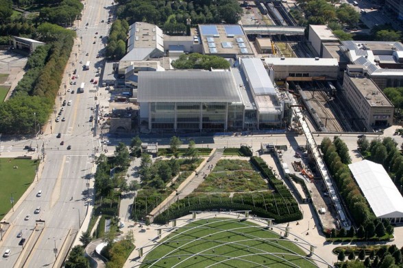
| The Art Institute of Chicago and Millenium Park |
By Pam Paulson
Stepping off the plane, Renee and I were engulfed by an
ocean of hot air. Ninety-five degrees and 103% humidity (as our waiter later
remarked). We caught a cab straight to the Art Institute of Chicago and met up
with Mark Pascale. Mark is curating a show of Martin Puryear’s works on paper
and invited us to discuss the prints we’ve made with Martin over the last 11
years. Graciously, Mark gave us a welcoming tour of the newish Renzo Piano
addition, including the spacious gallery Martin’s exhibition will occupy. The
light in the new section is refreshing, with windows overlooking native prairie
gardens.
![]() |
| Pam Paulson in the Print Room at the AIC |
Mark further indulged us by taking us into the cavernous
storage rooms of the works on paper collection, where row upon row of large
flat files housed works slumbering in a climate-controlled stupor. Mark opened
drawers and unshelved framed works, rousing Lee Bontecou etchings printed by Tatyana
Grosman, gigantic Russian war posters, a dog collage by Joan Brown, and a
charcoal study by Kerry James Marshall that I will never forget. Next up was
the conservation department, where we talked glue theory with the conservators
and enjoyed inspecting all their work areas and tools.
Finally, we found repose in the study room in the company of
“Profile” by Martin Puryear and kicked back for an overview of the material
that has been gathered to date for the show. Last fall, we shipped 99 working proofs
and miscellaneous ephemera from our projects with Martin to the Art Institute
to document the process of making the prints. It is really amazing to see this
idea for the exhibition take shape.
| Renee and Pam infront of the Kapoor |
Mark visited Martin a few months ago with Ruth Fine (curator
of special projects in modern art, National Gallery of Art) and Harriet Stratis
(head of paper conservation at the Art Institute) to take a look at his personal
archive of works on paper. Martin studied printmaking in Sweden and made highly
successful prints early in his career. Renee and I had glimpsed these early
works the first time we visited Martin’s studio. It was great fun to be
virtually reintroduced.
Exiting the museum, we swam over to Millennium Park, strolling
beside smartly designed fountains full of hot Chicagoans cooling themselves in
the mist. We wound our way over to the
fun house mirror, “Cloud Gate” (Anish Kapoor’s monumental bean) and around to
Gehry’s Jay Pritzker Pavilion. All wows!
The next day we looked at all the working proofs and the
correlating edition prints, analyzing how we got from A to B. Not always easy
to recreate, but thanks to usefully redundant documentation, we were satisfied
we had it right. Mostly!
Later, after a quick walk to the lake, we met up with our
old friend Stephanie Sherman for drinks and dinner at Gage, across from the
museum. Stephanie (an amazing art professional) introduced us to the very
handsome Billy Lawless, who owns Gage as well as Henri, its sister restaurant
next door. We relaxed with a great cheese plate, fine martinis, a venison
burger, and the fabulous staff. Then it was on to Henri for a memorable dessert
at the bar.
![]() |
| Andy Cutting & Brice McCoy at Henri |
Thankfully, the next morning, the temperature had backed
down, and rainclouds mitigated the blazing sun. Skirting downpours, we paid a
visit to Kerry James Marshall’s studio. Kerry is an amazingly productive
individual. He has multiple projects in the works and then some. We were
delighted to see several of his models, who closely resemble the one he worked
with while in our studio.
![]() |
| Barbi Dolls at KJM's studio |
Of great interest to me are the costumes Kerry and his
assistant have designed and sewn for his dolls/models to wear when he draws
them. They intentionally avoid recalling a discernible time period yet remain oddly
familiar. The use of oversized elements like buttons and textures from the
ribbing of socks upends the expected.
We boarded the plane back to the Bay Area exhausted and
inspired. However, we were certainly not as exhausted as this guy in Renee’s
row.
![]() |
| Face plant sleeper. |
Subscribe to:
Posts (Atom)